
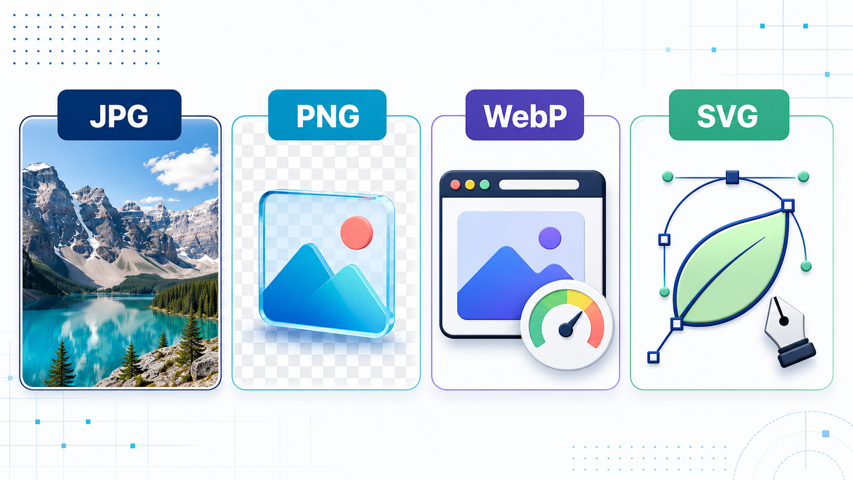
Choosing an image format is not simply a matter of changing a filename extension. JPG, PNG, WebP, and SVG store visual information in different ways, and those differences affect quality, transparency, scalability, file size, editing, and page speed. The right choice depends on what the image contains and how people will use it.
A photograph, a transparent product cutout, a website logo, and a software screenshot may look similar inside an image viewer, but they need different formats. This guide explains the four formats and gives practical rules for selecting one without unnecessary trial and error.
First understand raster and vector images
JPG, PNG, and WebP are raster formats. A raster image is a rectangular grid of pixels. Every file has fixed pixel dimensions, such as 1200 × 800. Enlarging it far beyond those dimensions eventually reveals softness, jagged edges, or individual pixels.
SVG is primarily a vector format. Instead of storing every pixel, it describes shapes, paths, fills, strokes, gradients, and text using XML. A browser redraws those instructions at the required size, so a well-made SVG logo can remain sharp on a small phone screen, a high-density display, or a large printed sign.
This distinction provides the first decision rule: use raster formats for photographs and pixel-rich artwork; consider SVG for logos, icons, diagrams, and illustrations that can be described as shapes.
JPG or JPEG: efficient photographs
JPG and JPEG are two extensions for the same image format. JPEG uses lossy compression, which reduces file size by discarding visual information that the encoder estimates people are less likely to notice. Higher compression produces a smaller file but can introduce block patterns, halos, colour smearing, and softened detail.
Use JPG for
Photographs with many colours, tones, shadows, and natural textures
Blog photography, product photos, property listings, and email images
Images that need broad compatibility with older software and devices
Situations where a modest quality reduction is acceptable in exchange for a smaller file
Avoid JPG for
Logos, icons, interface elements, and diagrams with hard edges
Text-heavy screenshots where compression can make letters look fuzzy
Images requiring a transparent background—standard JPEG has no alpha transparency
Repeated editing and saving, because each lossy export can remove more information
Keep a high-quality original or editing file and export a separate JPG for delivery. Do not repeatedly open and resave the delivery copy. For a typical web photograph, start around 75–85 quality, inspect it at its intended display size, and reduce quality only while the result still looks clean.
PNG: lossless detail and transparency
PNG uses lossless compression. When the image is decoded, its stored pixels can be reconstructed without compression damage. PNG also supports an alpha channel, allowing pixels to be partially or fully transparent. That makes it dependable for graphics that must blend cleanly into different backgrounds.
Use PNG for
Screenshots containing text, interface controls, charts, or code
Logos and graphics when an SVG version is unavailable
Images requiring precise transparency or semi-transparent edges
Pixel art, diagrams, line art, and graphics using a limited palette
Intermediate assets that must preserve exact raster pixels
Avoid PNG for
Large photographic hero images when JPG or WebP provides similar visible quality at a much smaller size
Camera-photo archives when the uncompressed or original camera file is available
Simple logos and icons that could be represented more efficiently as SVG
“Lossless” does not mean “small.” A full-resolution photograph saved as PNG can be several times larger than an appropriately compressed JPG or WebP. PNG is valuable when exact pixels or transparency matter, not as a universal maximum-quality option.
WebP: a flexible web-delivery format
WebP was designed for efficient delivery over the web. It supports lossy compression for photographs, lossless compression for graphics, alpha transparency, metadata, colour profiles, and animation. This combination allows WebP to replace JPG, PNG, or GIF in many website workflows.
Google’s published WebP comparisons report that lossless WebP files can be smaller than PNG and lossy WebP files can be smaller than comparable JPEG images, although the actual saving depends on the source image and encoder settings. Major modern browsers support WebP, making it a practical default for many website images.
Use WebP for
Website photographs where page speed and bandwidth matter
Transparent web graphics that are too large as PNG
Thumbnails, product grids, blog cards, banners, and responsive images
Simple animations when animated WebP is appropriate for the audience and tools
Think twice about WebP when
A recipient’s older desktop application, print workflow, or content system does not accept it
You need a universally convenient editing or interchange file
The image is a logo or icon that would scale more cleanly as SVG
You are preserving a master asset—keep the original source rather than only the optimized delivery copy
WebP is usually a delivery format, not a reason to delete the original. Keep the camera original, layered design file, SVG source, or high-quality PNG, then generate WebP versions for the website.
SVG: resolution-independent graphics
SVG stands for Scalable Vector Graphics. The W3C specification defines SVG as an XML-based language for two-dimensional vector and mixed vector/raster graphics. Because shapes are redrawn instead of enlarged as a fixed pixel grid, SVG is ideal for artwork that must stay crisp at many sizes.
Use SVG for
Logos, symbols, interface icons, and badges
Charts, maps, diagrams, and simple technical illustrations
Graphics that need CSS colour changes, animation, or interaction
Artwork displayed across phones, high-density screens, and large monitors
Avoid SVG for
Ordinary photographs, where describing every detail as vector data is impractical
Highly textured digital paintings that are naturally raster-based
Untrusted user uploads that will be embedded without sanitization
Workflows whose target software accepts only raster formats
SVG can contain links, styling, animation, and scripts, so treat an unknown SVG more like a document than a harmless bitmap. Sanitize untrusted SVG files or render them to a safe raster format before publishing. When SVG is used through an HTML image element, provide meaningful alternative text just as you would for a PNG or JPG.
Which format should you choose?
A blog or product photograph: WebP for modern web delivery; JPG when maximum compatibility is important.
A transparent product cutout: WebP for a smaller website asset; PNG when lossless interchange or wider tool compatibility matters.
A logo or interface icon: SVG whenever a clean vector source exists; PNG as a raster fallback.
A screenshot with text: PNG for exact edges; lossless WebP may be smaller if the destination supports it.
A social-media image: JPG or PNG according to the platform and content, because platforms often recompress uploads.
An illustration with flat shapes: SVG when it is genuinely vector; PNG or lossless WebP when it is pixel-based.
An animated image: WebP can outperform GIF, but consider video for long, large, or high-frame-rate animation.
A print master: follow the printer’s requested workflow; do not assume a web-optimized format is suitable.
Quality, dimensions, and file size all matter
Selecting the right format is only one part of optimization. A 5000-pixel photograph remains unnecessarily heavy if the page displays it at 800 pixels. Resize images near their required display dimensions, provide higher-density variants where appropriate, and let responsive HTML choose among sizes.
Set width and height attributes so the browser can reserve space before an image loads. Compress delivery files, remove metadata that is not needed, and use descriptive filenames and alternative text. Good alt text communicates the purpose of the image; it should not merely repeat “image of” or list the file extension.
A practical source-and-delivery workflow
Keep the best available source: camera original, layered design file, high-quality raster, or SVG.
Crop and edit the source without repeatedly compressing intermediate JPG files.
Resize copies for their real display contexts.
Export WebP or JPG for photos, PNG or lossless WebP for pixel graphics, and SVG for suitable vector artwork.
Compare output visually at 100 percent and at the actual page size.
Test transparency, colour, sharpness, loading behaviour, and accessibility in the final page.
Convert images with OpenToolkit
The OpenToolkit Image Converter can resize, compress, and convert common raster images directly in your browser. For more detailed changes, use the OpenToolkit Image Editor. Keep in mind that converting a low-quality JPG into PNG does not restore lost detail, and converting a raster logo into another raster format does not make it truly scalable like an SVG.
The short answer
Choose JPG for compatible, compact photographs; PNG for lossless pixels, screenshots, and dependable transparency; WebP for efficient modern website delivery; and SVG for logos, icons, and vector graphics that must scale cleanly. Preserve the original source, then create the smallest delivery asset that still looks correct in its real context.